At the beginning of 2025, mobile-first design has already become the basis of web development and website design, allowing for seamless user experience; therefore, designing for mobile-first is no longer an option—it's a must-have as 50% of the population uses mobile to access any business site, and nearly 80% of local searches on mobile devices lead to conversions. This blog discusses why mobile-first design matters more than ever, how it differs from responsive website design, and what businesses can gain from it.
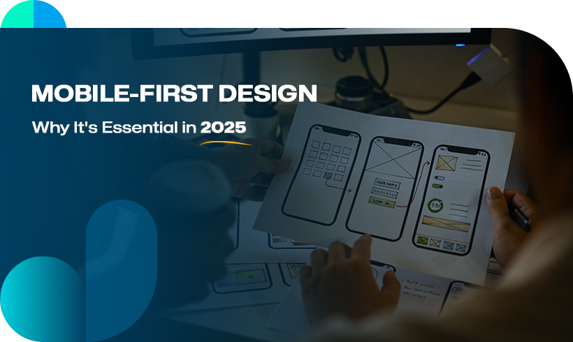
What is Mobile-First Design?
Mobile-first design is an approach where you first design your website for mobile devices and then desktops. It is an important strategy because, nowadays, most people use their smartphones to go online instead of laptops, tablets or computers. With mobile-first designs, your website will not only look good but also function well on other devices, hence giving the best user experience. This helps to increase website traffic and make sure that your website is responsive to all the possible screen sizes.
Why Is Mobile-First Design Essential in 2025?
The shift toward mobile-first design is driven by several factors that highlight its significance:
-
Increased mobile usage
By 2025, mobile devices are projected to account for more than half of internet traffic globally. Businesses that fail to prioritise mobile-first development risk alienating a significant portion of their audience
-
Google’s mobile-first indexing
Search engines are dutifully indexing and ranking the mobile edition of a website, like Google. This calls for companies to integrate mobile optimisation into their website creation services so that they can at least remain in their present positions or improve their search engine rankings.
-
Better user experience (UX)
Mobile users are looking for fast-loading pages, simple navigation, and attractive aesthetics. A mobile-first design approach is what assures these expectations will be adequately addressed, improving engagement and lower bounce rates.
-
Competitive advantage
Due to the increasing investment in website development services, businesses that implement a mobile-first approach provide superior user experiences and an edge in competition. It becomes important, especially in an industry where customer retention is a top priority.
Benefits of Mobile-First Design for Businesses
Here are some of the benefits of mobile-first design:
-
Improved accessibility
The mobile-first design ensures that websites are accessible to a wider audience, including users with slower internet connections or older devices.
-
Faster load times
By optimising for smaller screens first, mobile-first websites typically load faster, reducing the likelihood of users abandoning the site due to delays.
-
Higher conversion rates
Websites designed with mobile-first principles are more likely to convert visitors into customers, as the streamlined design encourages engagement and simplifies the user journey.
-
Cost-effective development
Starting with a mobile-first design strategy reduces the need for extensive redesigns or fixes, saving businesses time and money in the long run.
-
Future-proofing
Mobile-first development ensures that websites remain relevant and adaptable to new devices and screen sizes as technology evolves.
Principles Behind Mobile-First Design Strategy
The mobile-first design strategy adopted must comply with certain principles if success is to come about. These principles will include:
-
Content Comes First
Mobile-first design must centre around critical content and features of mobile users. Essential information is placed where it is easily accessible, away from the unnecessarily cluttering background information.
-
Go Minimal
Simplicity is the path to mobile-first design. Therefore, it involves very minimal layouts, fewer words, and less in the way of graphics, with the intention of enhancing usability and readability.
-
Optimise Performance
Use image compression, code minimisation, and caching techniques to ensure fast load times. Performances on mobile cannot be taken lightly as they usually can convert or switch off mobile users.
-
Implement Touch-Friendly Interfaces
Design for touch screens by incorporating large buttons, intuitive gestures, and ample spacing between interactive elements.
-
Responsive Scaling
While mobile-first focuses on small screens, ensure that the design scales seamlessly to larger devices to maintain consistency across all platforms.
Mobile-First Development in Practice
Implementing mobile-first development requires collaboration between design and development teams as well as a focus on user testing. Observed below is how businesses can incorporate mobile-first principles into their web development services:
-
User Research
Learning the needs and behaviours of the target audience will create a design that resonates with them.
-
Wireframing for Mobile
Starting with wireframes, employ the mobile screen layout to be intuitive and user-friendly.
-
Progressive Enhancement
Build working mobile versions first, and then add features and enhancements for larger screens.
-
Regular Testing
Testing the design on different devices and screen sizes allows immediate correction of usability flaws.
-
Collaboration with Experts
Getting mobile website design services will help you implement a mobile-first approach.
Role of Web Development Company in Mobile-First Design
At Digiwhiz, we provide web development and design services to help implement mobile-first design strategies. As it were, we are involved with optimising load times, integrating responsive features, optimising for a wide range of devices, and following best practices for design strategy, usability, UX, etc.
We have skilled developers and a design team who can follow and implement all the new trends in the industry of web design and development. Otherwise, there is no need to compromise on quality. Partnering with Digiwhiz ensures that your website design and development align with the latest trends.
Take Away
Mobile-first design has transitioned into an important factor in a successful web development plan. In a fast-moving digital world, it would give companies a competitive edge over others in the web space while also enabling them to provide easy accessibility and usability and ensuring websites were built to live longer.
Website design services and web development services can help businesses create mobile-first websites that provide growth and success through 2025 and beyond.
If your business hasn’t yet adopted a mobile-first approach, now is the time to act. The future is mobile, and a mobile-first design strategy is the key to staying relevant in an increasingly mobile-centric world. Contact Digiwhiz today for expert mobile-first web design solutions.


